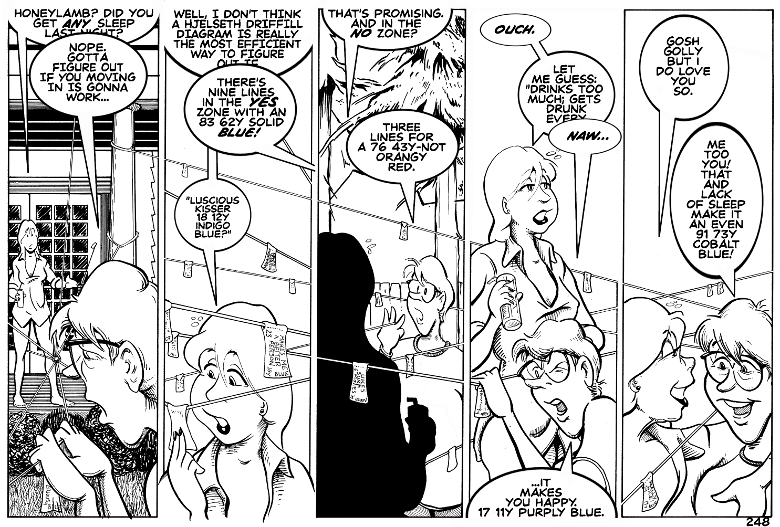
“The Hjesleth-Driffill Diagram, created in 1923, was a joint Norwegian-American attempt to codify temporal predictions in spatial terms. Events and influences were given three values: a numerical weight, a distance along either a y or a y-not axis, and a color. The color was determined by the preference of the primary diagram creator.
The diagram enjoyed a fair amount of popularity during the Roaring 20’s, along with goldfish swallowing and phone booth stuffing. When it failed to predict such events as the Stock Market Crash and the Great Goldfish Shortage of 1927, it was quickly abandoned. These days it is used primarily by engineers trying to figure out relationships.”
But then, you knew all that.
Oh that Larry. As we know, his favorite color is blue, so that explains one part of the diagram.
Friday, Larry and Edison discuss the three negative strings. I think you can guess what at least one of them will be.
We’ll see you then!

Ah, yes. Love is blue.
Hurrah for the Paul Mauriat reference!
Sometimes I wish this had a “Like” feature. Well played. Well played indeed.
Hjesleth-Driffill Diagram, eh… Oh Charlie I love it when brilliance makes subtle cameos. 😉
I am very curious to find out about the negatives. I am guessing that a lack of divorce and regrets/shame about the past might be two of them.
Subtle cameos? Pure coincidence, my dear.
And you’re not very far from the mark. I can say no more.
methinks thou pullest our lower limb….
Has it got bells on?
OK colour me embarrassed I tried to Google :-
Hjesleth-Driffill Diagram.
Shoulda know better.
Sounded so convincing as well.
Whoever these Hjelseth and Driffill were, they must have been as gods among men (and women). 8 feet tall, perfectly symetrical features, and shooting rays of pure wisdom and knowledge from their eyes.
One assumes…
Love it, Charlie. 🙂
Yes, yes they were. Kind, compassionate, clever, funny, understanding and supportive.
I’m afraid we shall not see the likes of their kind in our time, my friend.
“…a distance along either a y or a y-not axis” — a Why or Why Not axis?? Grooooaaan…